Bounce rates can be hard to fathom and for most businesses, these are somehow always through the roof. As a content marketer, you must be focusing on multiple bounce rates – for blogs, websites, landing pages, phew! The list never ends. When I was finally able to bring our blog bounce rate down to 2.67% (yayyy!) this year, I thought I was a content marketing genius! Until one day, I got a wake up call!
The landing pages were still showing pretty high bounce rate – not through the roof but high enough to shoot me through the roof while I grasped the reality. But now I am back to earth and ready to take you through some of the tried and tested landing page optimisation tricks for better conversions. Grab some coffee and popcorn, people!
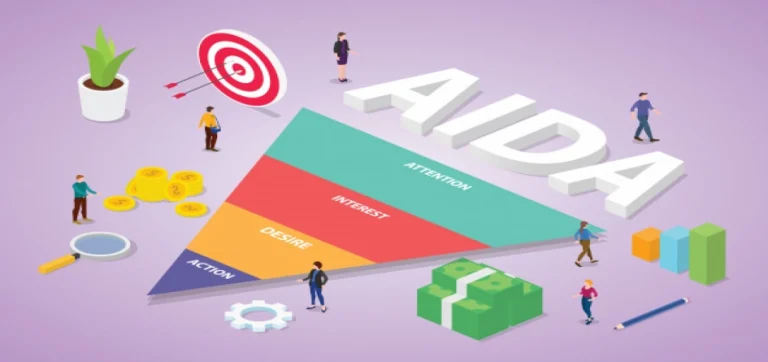
Landing Pages – Are Your Fundamentals in Place?
You can’t brew a great cup of coffee without getting the fundamentals right. Don’t believe me, look at your coffee right now! If you are looking at your landing pages with the same disownership, then you’ve probably missed out on the basic fundamentals to begin with. Since landing pages are an essential part of your inbound marketing strategy, it’s important you set the right benchmark. Let’s explore some of these:
- Consistency – Just like you can’t write consistency as “consistensy”, in the same manner, you can’t be inconsistent with how a landing needs to look like. Are your images high resolution? Is the text aligned? Is the messaging and tonality complementary? If it’s a series of NOs, then you’ve caught yourself off guard so well.
- What’s popping out? – Ever noticed a video thumbnail and decided whether you wanted to click on it or not? They always put just the right image to grab your attention, don’t they? Well, that’s because they know that particular image will pop out to you.
- Color – If the overall color palette is not matching with your brand guidelines and every landing page is a totally different kaleidoscope of colors as compared to the rest, then you are in trouble. Following the brand guidelines is basics and the fundamental right of every landing page! Totally!
By now, you’d know whether your fundamentals are out of place or not. So, what next? There’s a list of things you can implement after correcting the basics. Let’s explore them in detail (are you out of popcorn, alreay?):
How are your Headlines Performing?
It’s an easy one! That’s the first thing anyone notices when they land on your landing page. If your headlines are not making sense to them, how beautiful the rest of it is wouldn’t really matter. Keep in mind these few things while crafting headlines:
- They should be “catchy and easy to grasp” if you are going to keep one. “10 ways to know if your coffee is getting cold while you read an article” vs “10 ways your coffee is telling you it’s too late”. You tell me, which one?
- It’s important that you write in correct English that’s universally acceptable. “10 ways you’re coffee is telling you its too late” vs “10 ways your coffee is telling you it’s too late”. I mean, even the word document is showing me an error at this point. So, keep in mind you are using correct English.
- If you haven’t tried humor yet, it’s probably time that you do. A HUG event we conducted early this week saw a 50% higher registration rate and attendance simply because this time, I tried humor in my email copy and even subject lines, which just struck a chord with everyone! No kidding! So, humor them.
- Solving a problem through your heading is something not many people try. But you can! Try giving them a solution in the heading itself and shorten their buying cycle further.
Spare them the Clutter and Never-ending Navigation
Not everybody likes to keep scrolling down to find the CTA button that they can finally click on or going through too much information on a page. If you are going to ask them to find a needle in a haystack, then you might as well try knitting. Don’t give them a full-website feel on a landing page. If after a good amount of effort they’ve finally landed on your landing page, don’t lose them simply because they started looking for the needle too.
After you’ve created your landing page, step back, close your eyes for 5 seconds, and recollect everything you could retain from it. Have your colleagues do the same exercise. And if you work remotely like me, just ask that nosy neighbour. They’d love to give you “opinions”. After you understand what stood out, you know that those are probably the best or the worst parts of the landing page. Rethink, redo, and repeat the same exercise till you are satisfied with the final look.
More than one CTA on a Long Landing Page
If you absolutely have to create a long landing page, make sure there are more than one CTAs. The attention span is small, and users don’t like to navigate through an ever-lasting landing page. So, to optimise a long landing page, make sure there’s a CTA trail that you are leaving through the the whole page, at the same time not overdoing it. It might also be worth mentioning that too many CTAs can adversely affect your conversions.
Since different people react to CTAs differently, if they are able to connect emotionally to your message and there’s a CTA right there to complement that, they’ll instantly click on it. And that’s what you want.
Help Them Establish Trust in You
If visitors don’t find your landing page oozing trust, they really wouldn’t bother. There are a few tactics that you can employ to make sure they have at least established trust in your brand at an initial level:
- Add badges such as “XYZ certified”, “ABC tested”, etc
- Add small accomplishments such as “DEF verified”, “awarded no. 1 by !@#”, etc
- If possible, make these clickable so people can check the authenticity
- Of course, don’t overdo badges or try too hard
Visitors can always and easily sense “genuine” and if you are being too good to be true or coming across as a total fake, then you’ve already lost them.
Overall Messaging and Content
Content being the core of your messaging, it’s important to help the visitors circle back to you in the end with the help of it. The message should connect emotionally and provide real value to them. Write straight, to the point, clear, concise, try humor, and support what you are selling. This is where you also refrain from using any gimmicks to lure them into signing up or taking their contact details.
Ever seen a thumbnail on a video that was totally enticing and when you opened it, the whole thing just didn’t match and click? These are tactics that marketers all over the world use to initially lure the visitor into giving them their contact details so they can later mass email them. Yes, it’s not right and doesn’t work in the long run. So, keep your message focused on what value you are proposing to them in exchange for their contact information.
Really Try to Stand Out
Exactly like trying humor, which takes guts btw, try using powerful analogies and stand out from the rest of your competitors. Sometimes, it’s enough for your visitors to know that you are bold and unstoppable. Visual eye candy, even if it’s a baby picture or something as outrageous as the Groupon’s Cat, can do wonders for your overall conversion rate even if the picture isn’t really going with your messaging. But there’s a thin line here. If you are feeling uncomfortable with what you are putting out there, your visitors will sense it before you even know it. So, go with your gut or ask a few colleagues what they of a particular picture or analogy you’ve used.
Quick Refresher
Landing pages are probably one of the best ways to experiment what works for your brand and what doesn’t. With testimonials (if you’ve got any), terms and conditions in easy language (if it’s necessary), endorsements, catchy stats about your brand, a short form, the right color palette, trying something out of your comfort zone, consistent layout, CTAs, and much more, you can greatly increase your conversion rates.
Which tactics have you used on your landing pages? Share with us in the comments below.