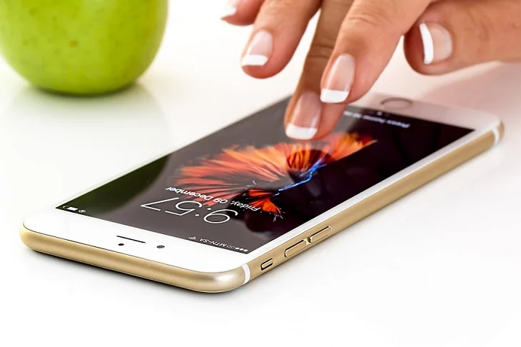
Now, it’s time to get responsive to smartphones
With the use of smartphones increasing manifold, once you decide that web design is what you want to do or have already started learning it, then you must also know what mobile responsive web design is.
Days are long gone when web designing for a single device was a thing. Think about all the time you spend on your mobile device vs your desktop and you will know why I am stressing on web designing for mobile devices as an important phenomenon today.
The Complete Guide To Website Wireframe Design
For example, if we developed multiple versions of a website that would work for every device, this process would not be practical and will prove to be expensive! This would make the sites invulnerable to future technology changes and also nearly impossible to maintain. Responsive mobile design is an effective solution to keep your website secure in the future.
What is mobile first responsive design?
Responsive mobile design means that your content adapts to the screen on which you want to view it. Smartphones and tablets take up less screen space than desktop devices. Your layout may not fit as much on the screen as you want and for this you need to adjust the layout according to that particular device.
Mobile-first web design is one of the best ways for people to visit websites using smartphones.
Web designers and developers can provide a seamless experience for the visitors by creating a website with smartphones and tablets in mind.
Top 5 Website Design Trends You Must Watch Out For In 2022
To start with, they must sketch out how the website layout should look on a mobile screen before adapting it to a desktop screen.
3 important points to remember while making a website responsive
-
Fluid Grids: Before proceeding further, let me tell you what a fluid-grid is after all. We create a website in a large format or large screen like on a desktop/laptop, but we need a fluid-grid for very small screens like smartphones/tablets. In fixed width layout the dimensions are set in pixels whereas in fluid design the size of the layout is defined in percentage by which it adapts itself to the available space according to any screen resolution and size of the browser window and becomes visible without any restriction.
-
Fluid Images: Responsive images will automatically adjust to fit the size of the screen.
img {
width: 100%;
height: auto;
}
- If you want an image to be scaled down even though no scale is larger than its original size, you want to use max-width:100%
img {
max-width: 100%;
height: auto;
}
img {
max-width: 300px;
width: 100%;
height: auto;
}
/* Extra small devices (phones, 576px and down) */
@media only screen and (max-width: 575px) {.......}
/* Small devices (portrait tablets and large phones, 600px and up) */
@media only screen and (min-width: 576px) {.......}
/* Medium devices (landscape tablets, 768px and up) */
@media only screen and (min-width: 768px) {.......}
/* Large devices (laptops/desktops, 992px and up) */
@media only screen and (min-width: 992px) {.......}
/* Extra large devices (large laptops and desktops, 1200px and up) */
@media only screen and (min-width: 1200px) {.......}
Click on bootstrap breakpoint to know about it in detail.
Benefits of responsive web design:
-
More mobile traffic
-
Faster mobile development at lower costs
-
Lower maintenance
-
Boost for SEO speed
-
Higher conversion rates
-
Consistency in design and brand
-
Easy analytics reporting
If you need mobile-friendly design, then you are at the right place. Get in touch.


